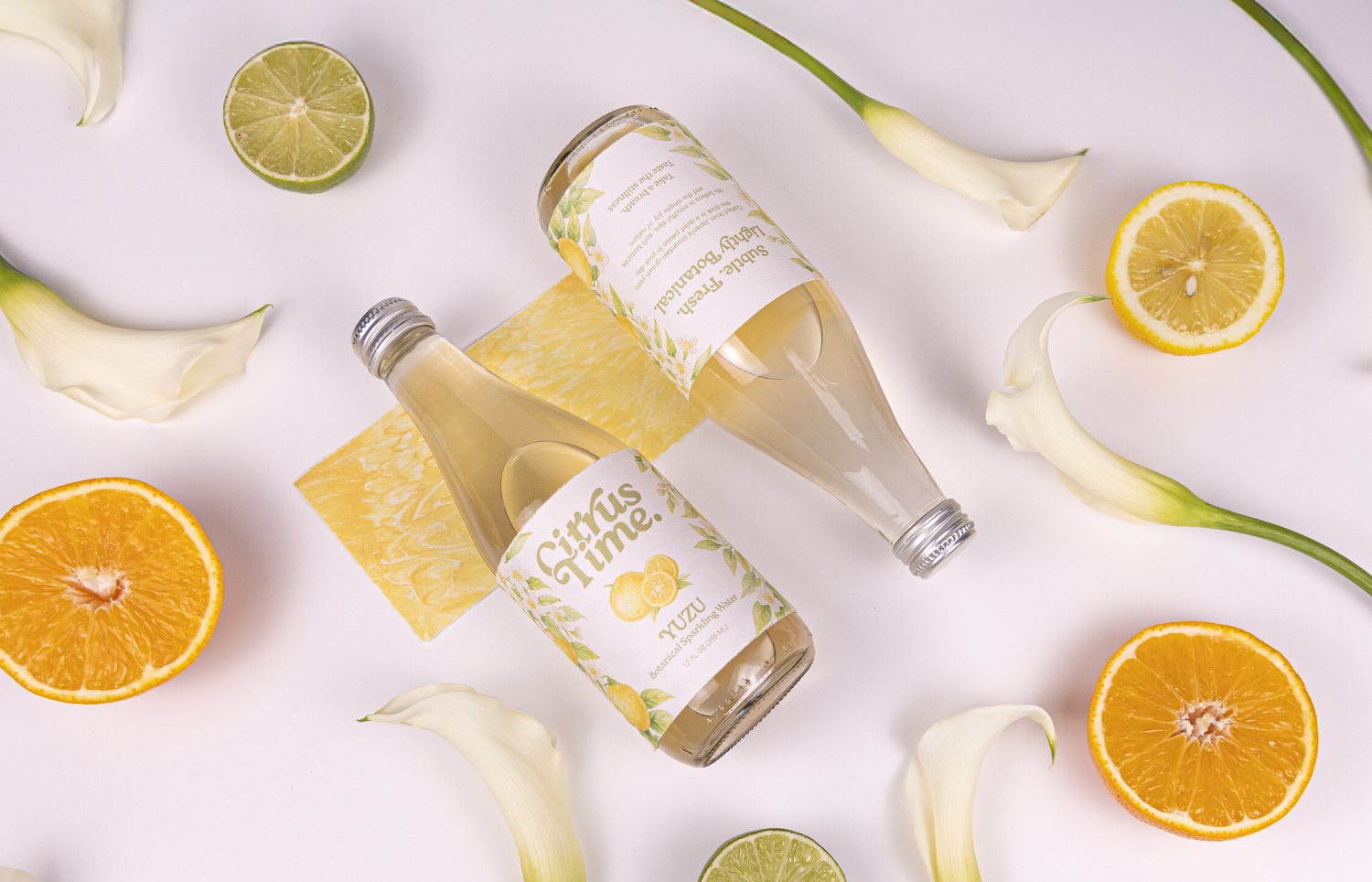
Citrus Time is a botanical sparkling water rooted in the clarity of Japanese citrus and layered with plant-based ingredients. Each bottle is made not only to quench, but to soothe — a small pause in the day.
The identity pairs minimalist calm with natural warmth, sitting between natural purity and everyday elegance for people who value simplicity with depth.
[Design process and AI workflow available upon request.]
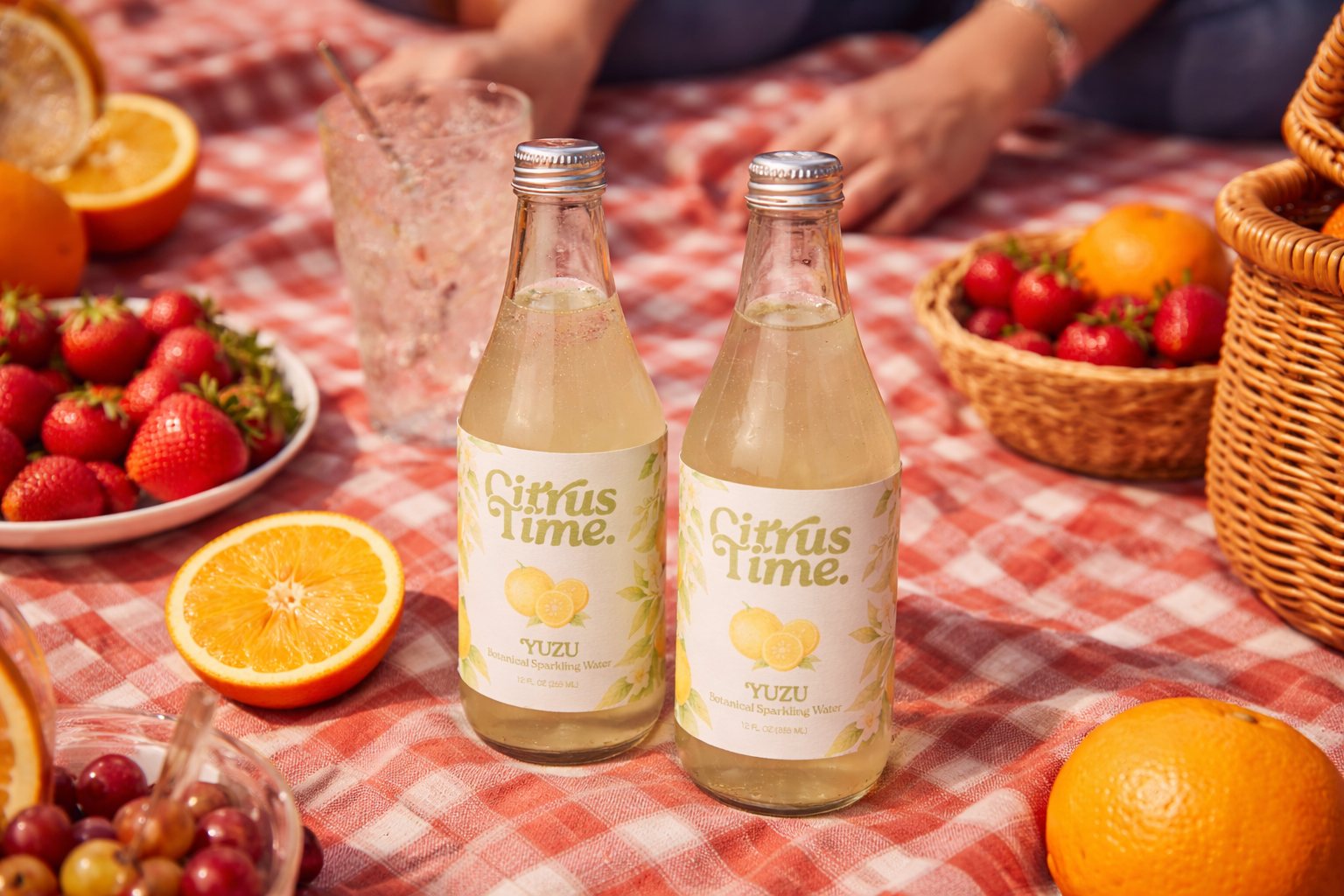
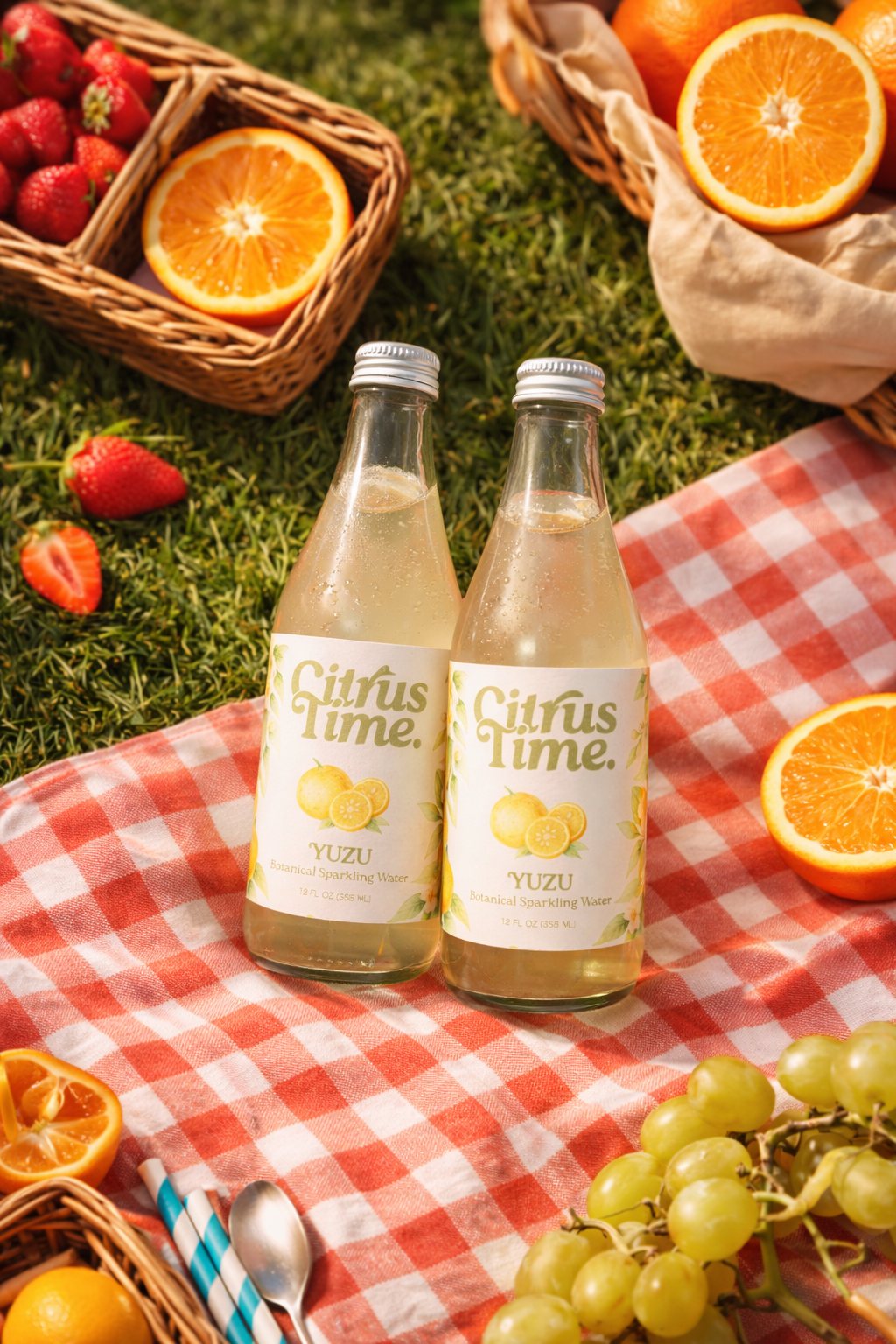
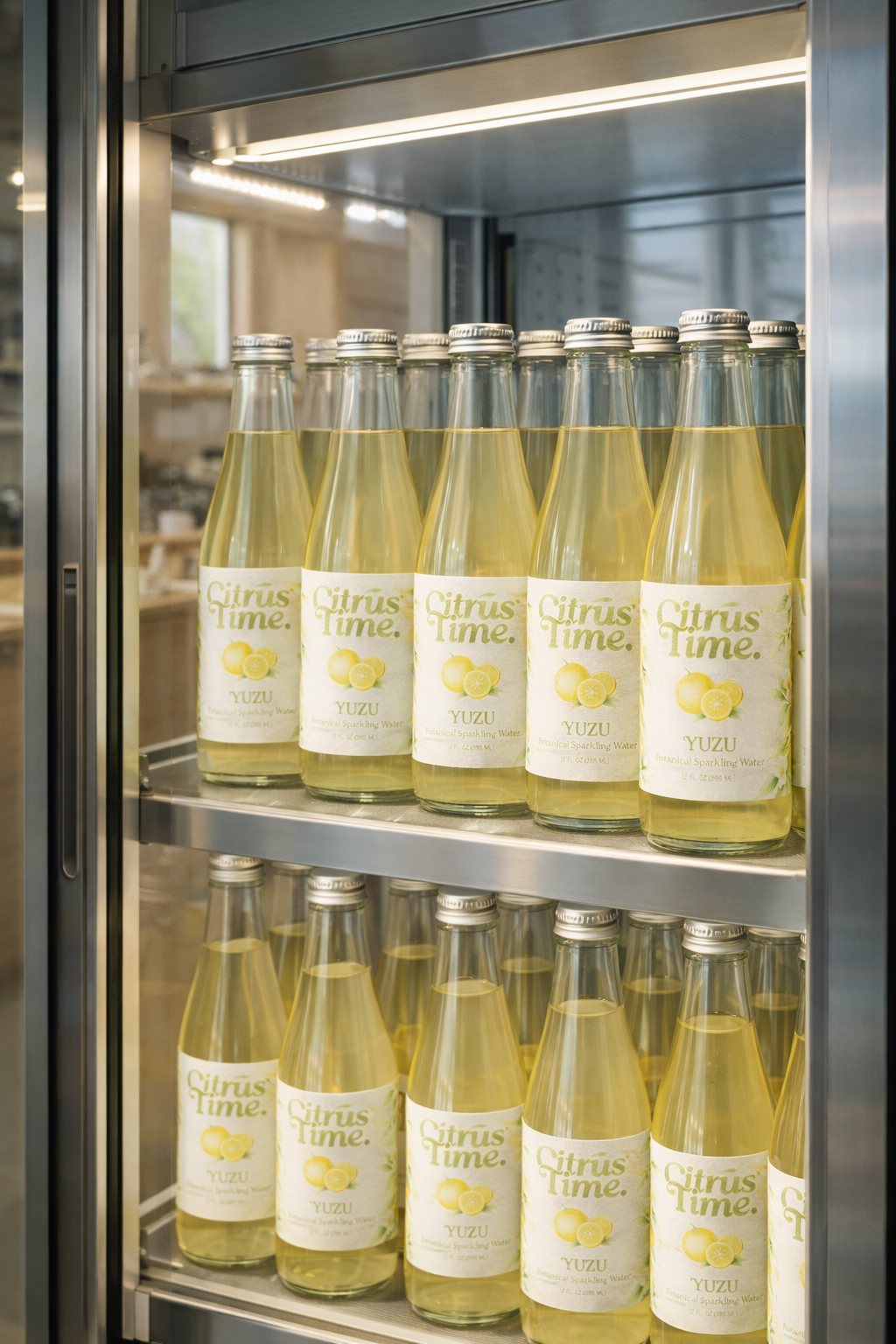
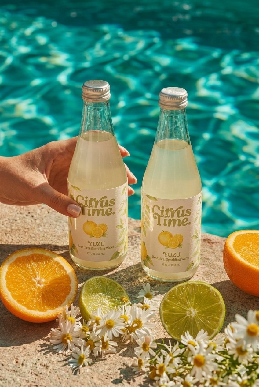
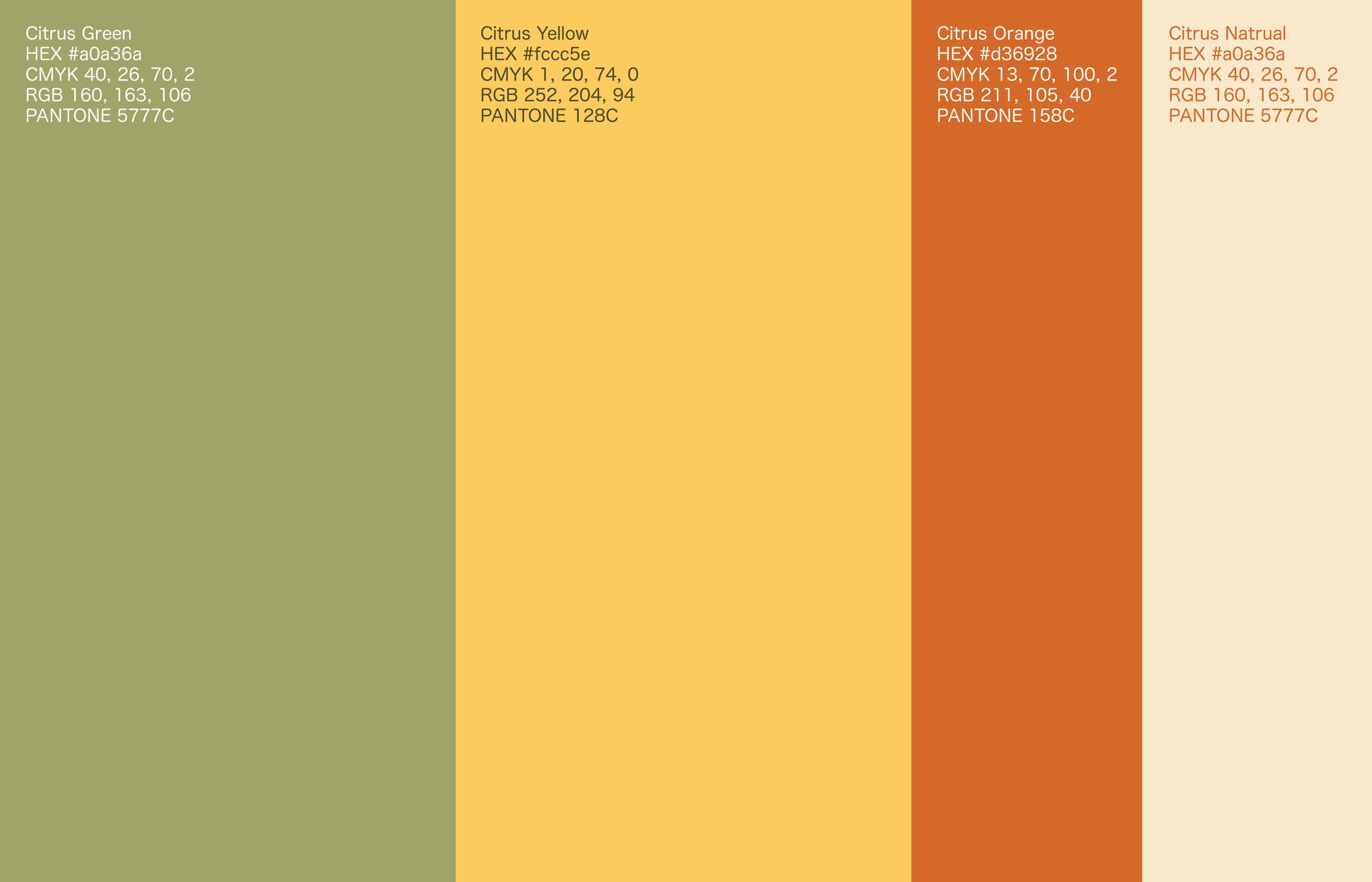
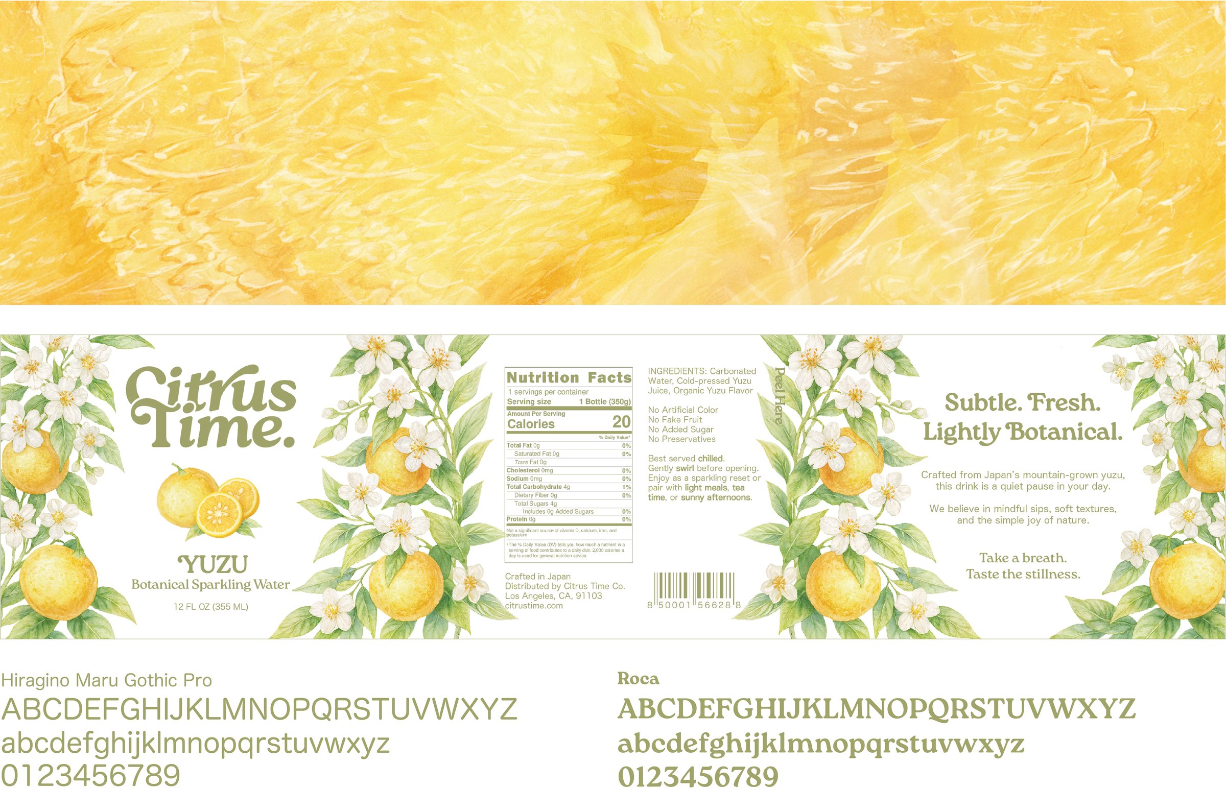
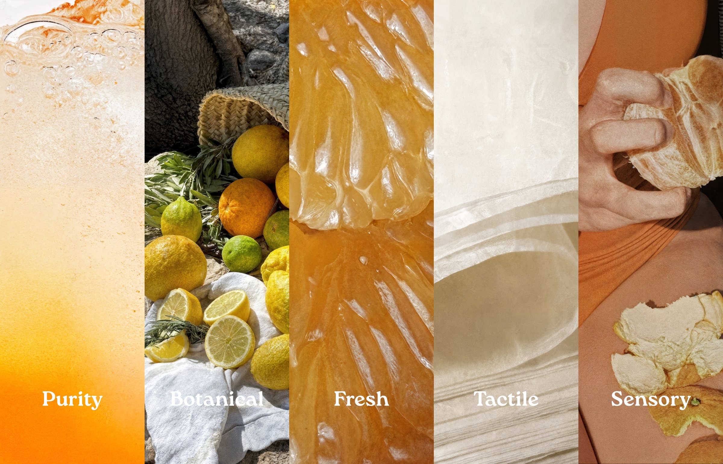
A soft, rounded wordmark in olive green is paired with a palette drawn from citrus: yuzu yellow, orange and cream. The yuzu label combines botanical illustration with clean typography, guided by five values: purity, botanical, fresh, tactile and sensory.

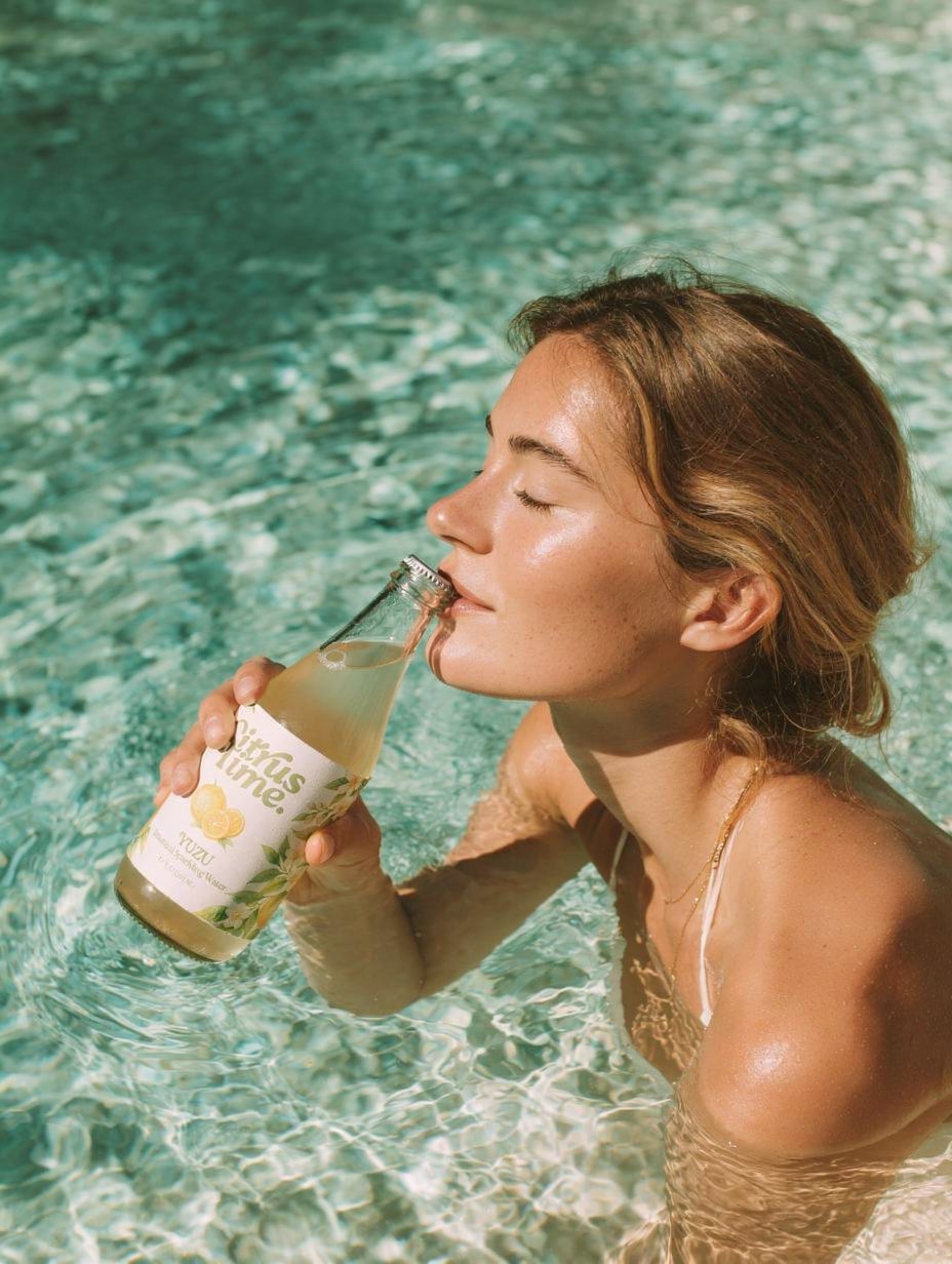
Studio still lifes with citrus and calla lilies, alongside a poolside series in bright summer light, place the bottle in calm, sunlit moments.
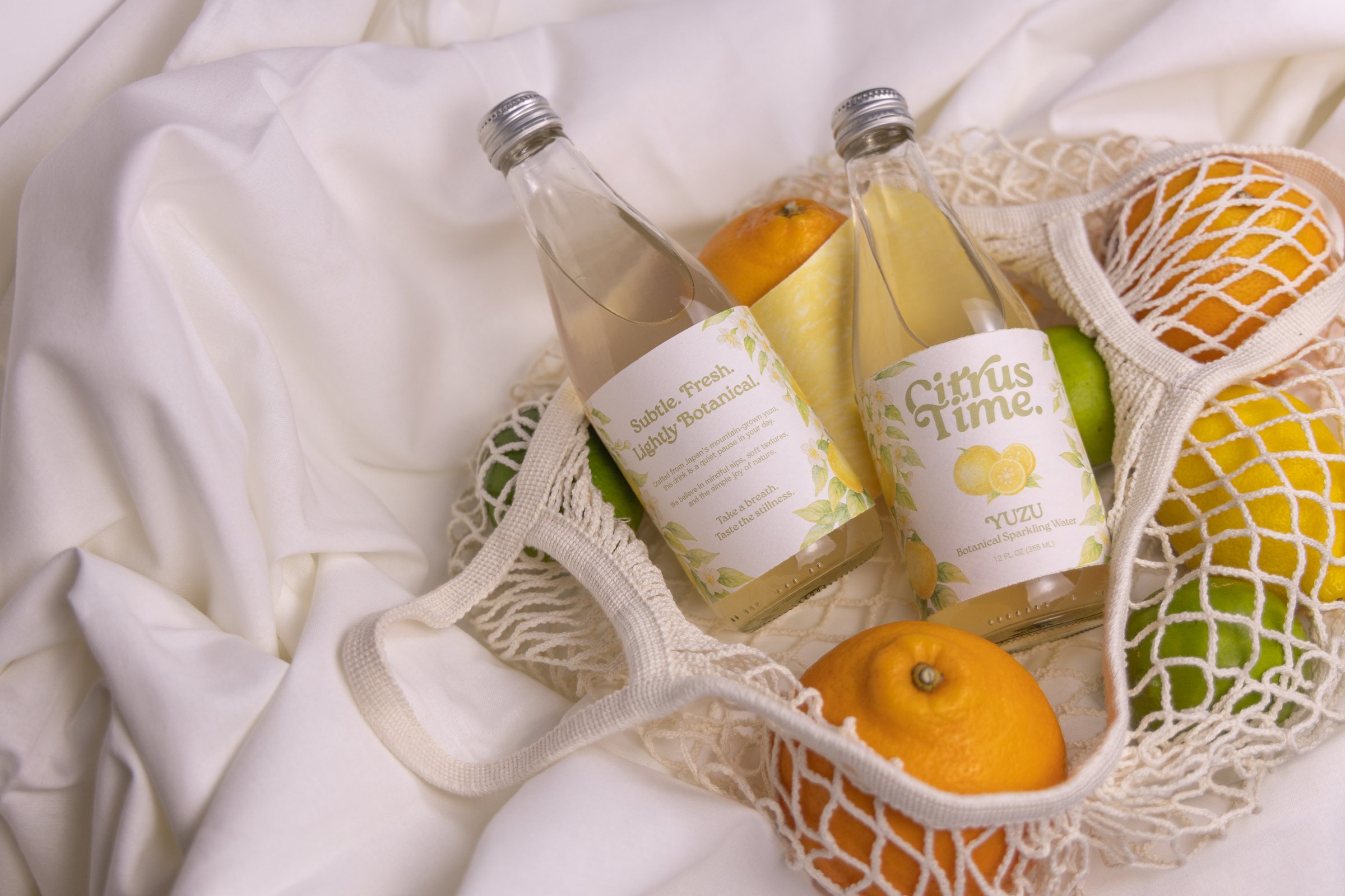
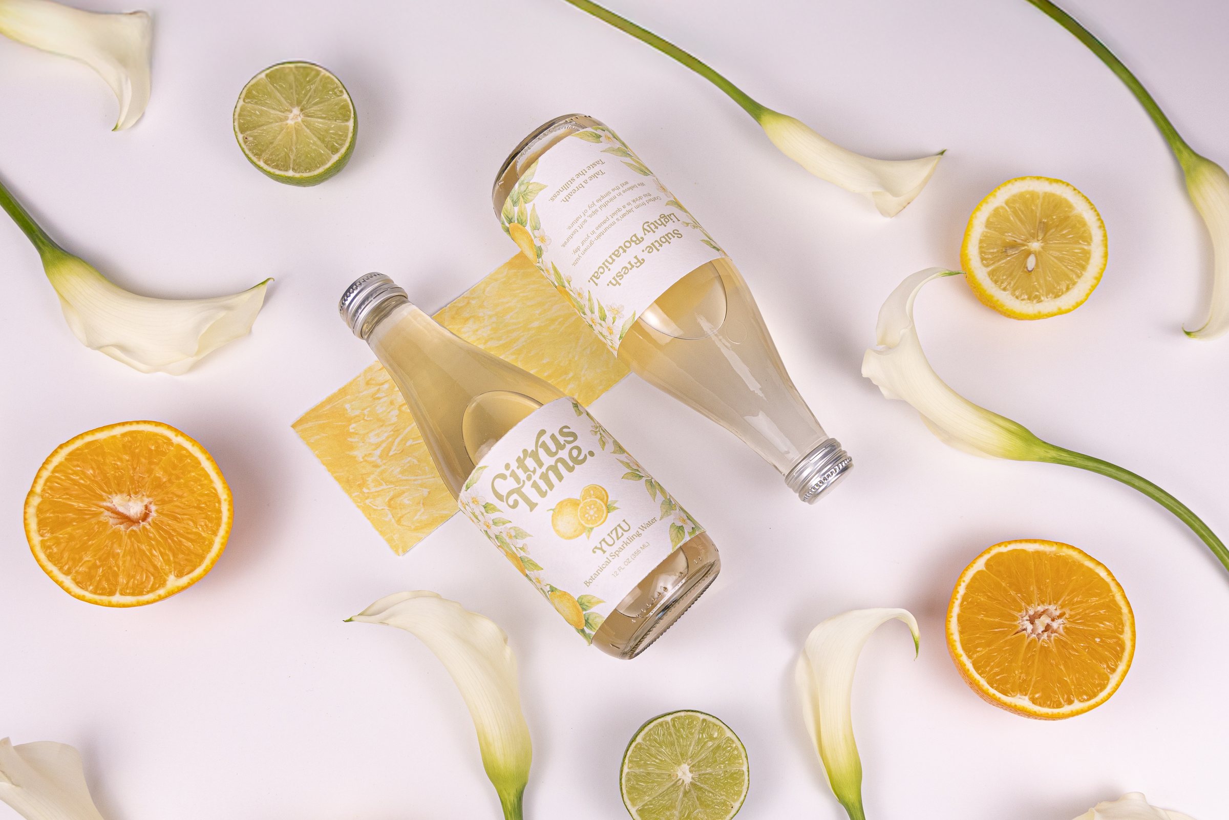
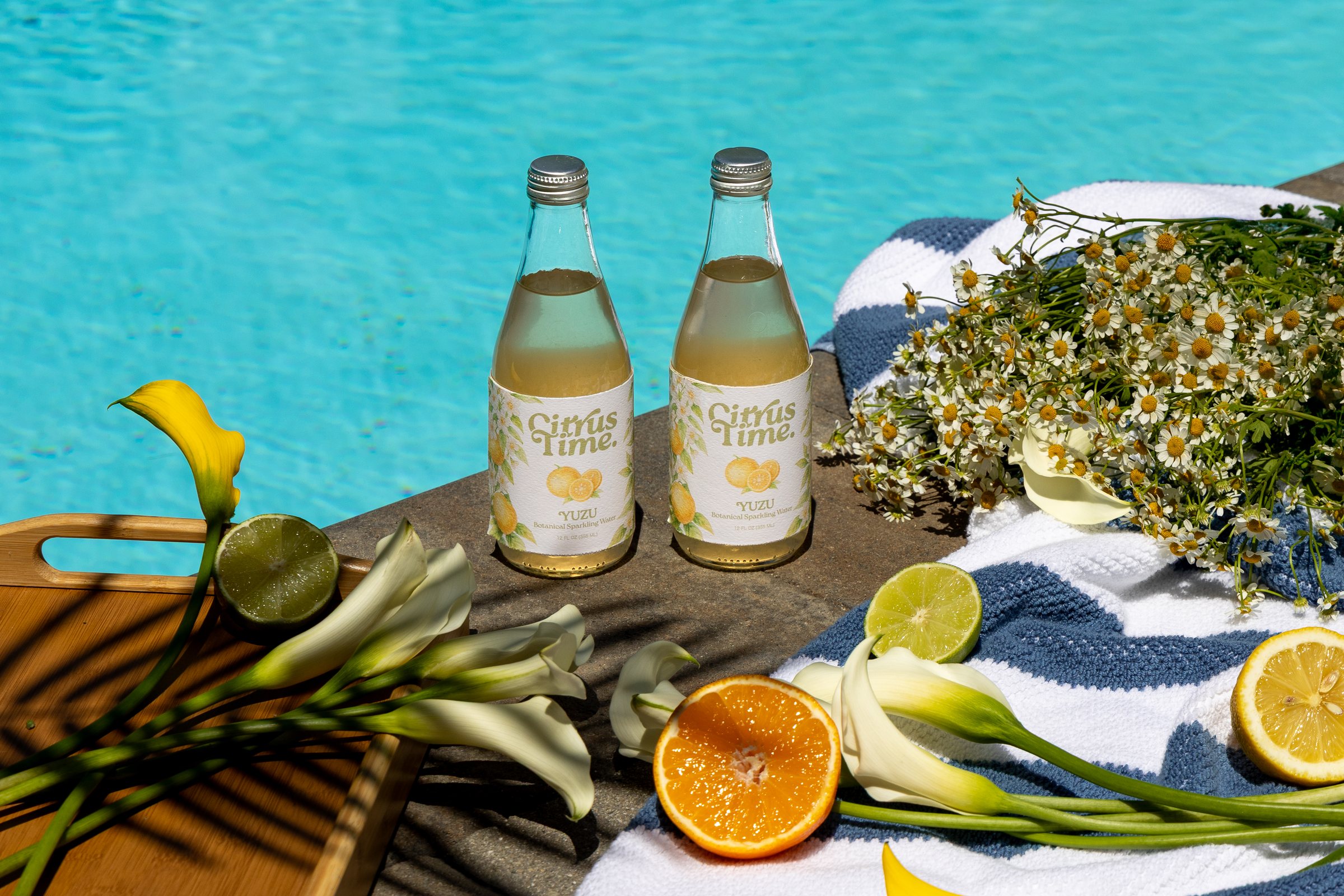
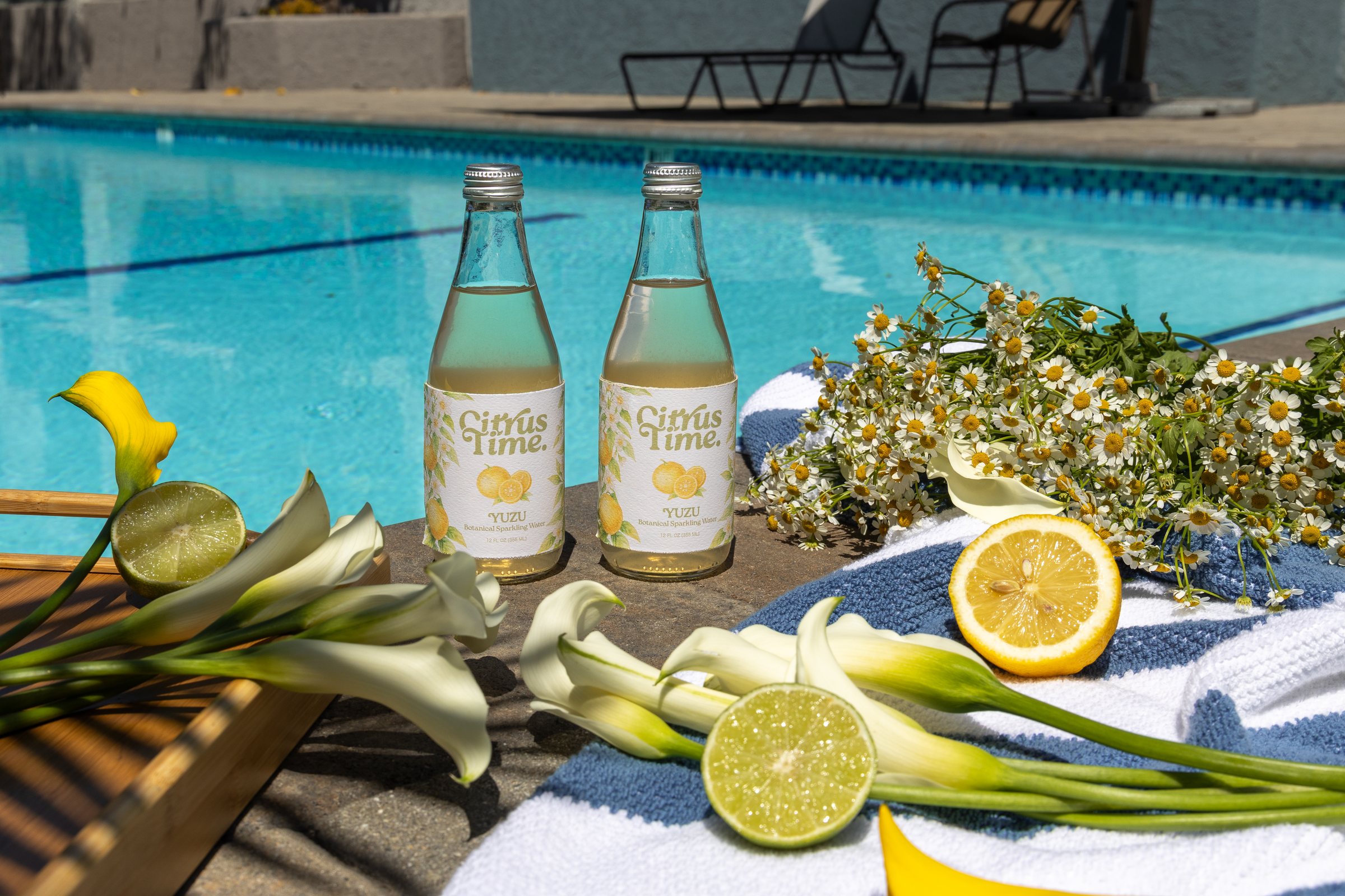
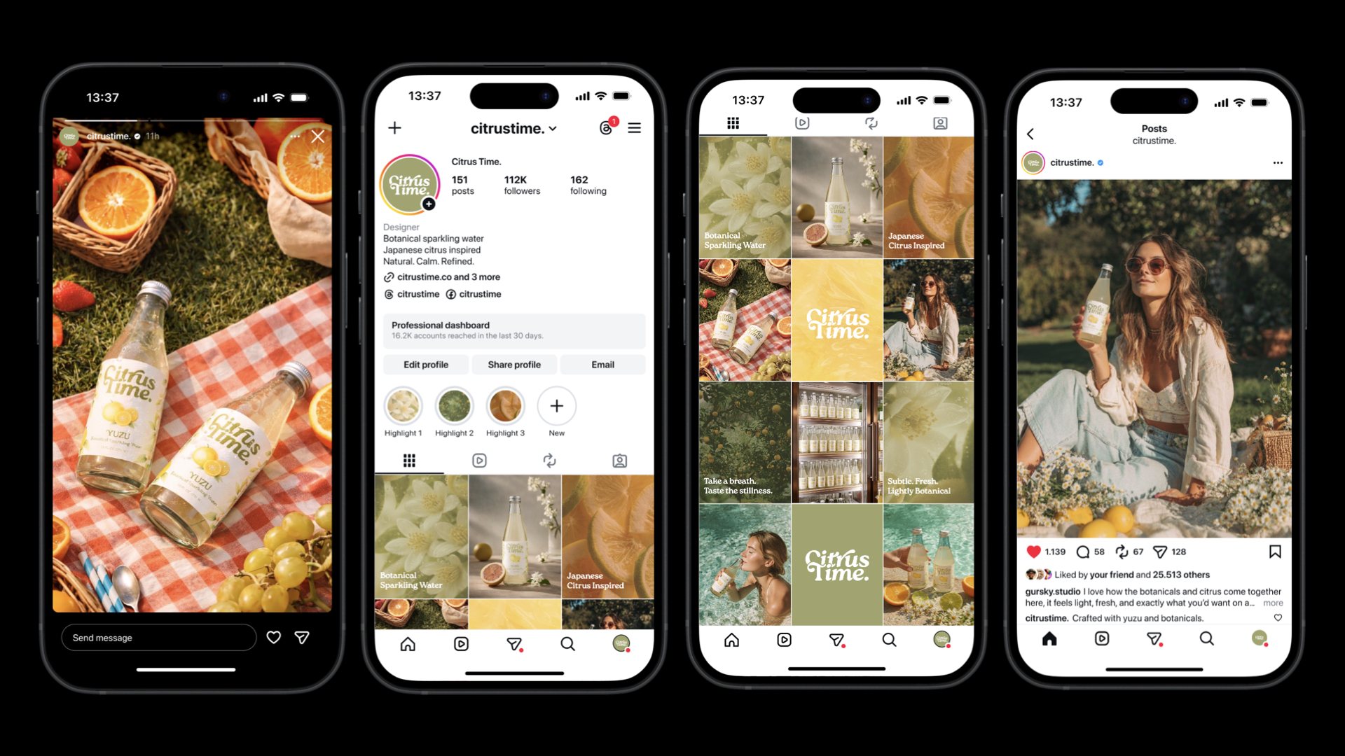
AI-generated lifestyle scenes — a picnic, a poolside afternoon, a stocked fridge — carry the brand into social media, showing the drink in everyday moments.